I saw this promoted tweet today. It was crafted enough to entice me to click through. Good right? Not really, keep reading…
All coupons save money. Naked Juice coupons do #gooddeeds. Grab this coupon & learn how you can make a difference at http://t.co/EA1RqHoaKg.
— Naked Juice (@nakedjuice) March 7, 2013
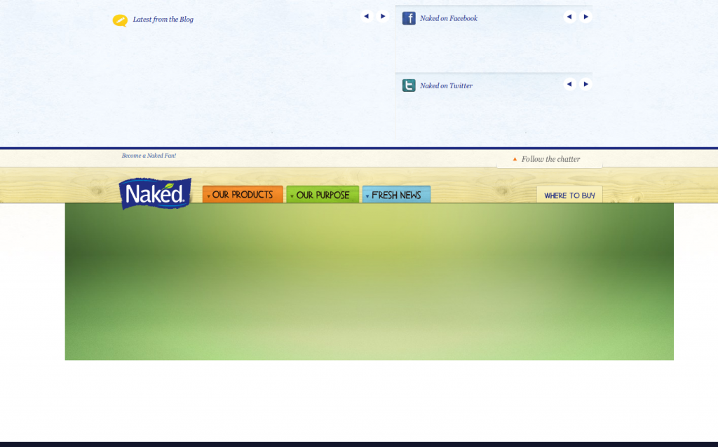
The problem is, I was testing sites and had my JavaScript and Flash off but nearly the entire site – and certainly the message and call to action – were all in a Flash animation. Despite the time, effort and other resources involved in creating the campaign, landing page and promotions, this campaign fell on blind eyes and was a waste of the click and my time.
Not only could I not see the ad, but when I did take the time out later to turn Flash back on (I was still interested), the interactive animation made me drag a slider across 15 frames, each with major animations and text until I finally got to the coupon. There was a shortcut that allowed me to skip the dragging, but it wasn’t obvious to me until I went through the ad several times. Bad call to action.
This is how I saw the ad:

The Trend of No Flash & Mobile Devices
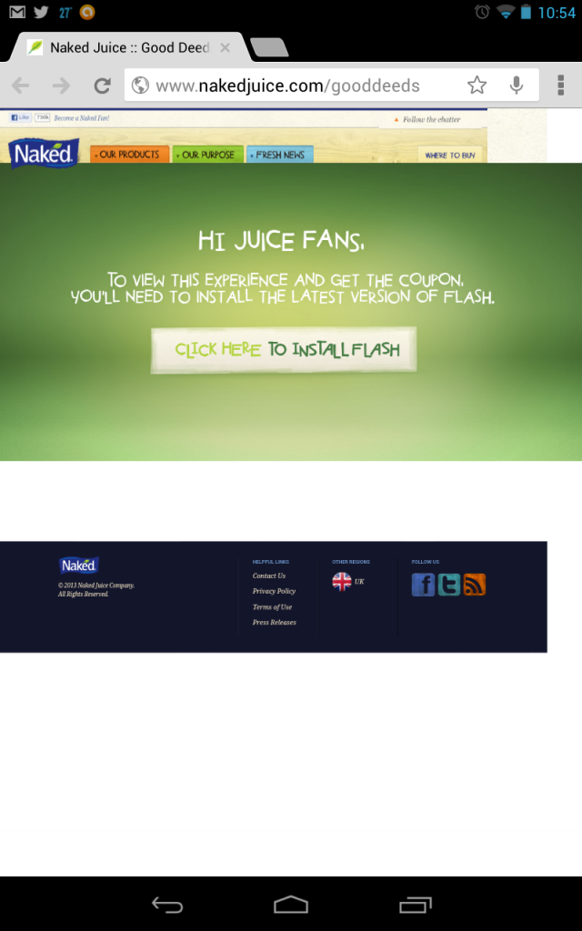
Most people will likely think I may be an anomaly. For the most part, that may be true. But it’s changing. FAST. With the exception of older Android devices running Android 2.4 and earlier, most mobile devices no longer display Flash. My apologies to Flash and ActionScript programmers (I’m one of them!), but the time has come to let go.
This is what mobile users see:

Marketers: It’s really time to let go. Some statistics:
- A recent NPD survey suggested over 37% of PC owners are moving daily activities to a mobile device
- A two year old Google Survey concluded 77% of people use their computer less and tablet more.
This Naked Juice ad was a Twitter campaign and I’d suspect that Naked Juice is also running campaigns on other social platforms. So some more mobile / social stats:
- Over 62% of 18-34 year olds and over 40% of 35-64 year olds access social media with a mobile device (ad Tech).
- Comscore shows social media usage is 39%.
Mobile is Important!
Having a bad experience on a retailer’s mobile site is almost detrimental to your brand, while having a mobile-friendly site give exponential benefits.
- 55% of mobile users a bad perception of your brand after encountering a site that is not mobile-friendly
- 61% of mobile users to flat-out leave a site that isn’t mobile friendly
- 52% of users said that a bad mobile experience made them less likely to engage with a company
- 48% said that if a site didn’t work well on their smartphones, it made them feel like the company didn’t care about their business
- When they visited a mobile-friendly site, 74% of people say they’re more likely to return to that site in the future
- 67% of mobile users say that when they visit a mobile-friendly site, they’re more likely to buy a site’s product or service
What else could go wrong?
I’d love to know how Naked Juice will measure this campaign. The link from twitter hit the t.co URL shortener and redirected me directly to nakedjuice.com/gooddeeds. That’s fine. However, that same URL is all across their home page. How will they differentiate their paid campaign visitors from anyone else who shared that link on Twitter? Unless you tag your inbound links, you can never truly understand the ROI of a campaign.
In Search of Good Landing Pages…
A good landing page will be accessible to all users. It will contain content that not only continues the messaging from the ad (or promoted tweet). It will make the visitor want to keep reading and follow through. The call to action will be clear, stand out and be undeniably easy to complete. Lastly, you will measure. You will tag the campaign to differentiate each which online channel performed well and which didn’t.
Marketers: Get rid of Flash – especially for a paid campaign. It’s a waste of money. And not reliably measurable.
In some ultimate irony, Naked Juice’s campaign states they’ll donate fresh produce to charities for every coupon redeemed. Yet, they apparently did nearly everything that would make large numbers of people not download a coupon. Instead of wasting the ad dollars, why not simply put that money toward the charity?
