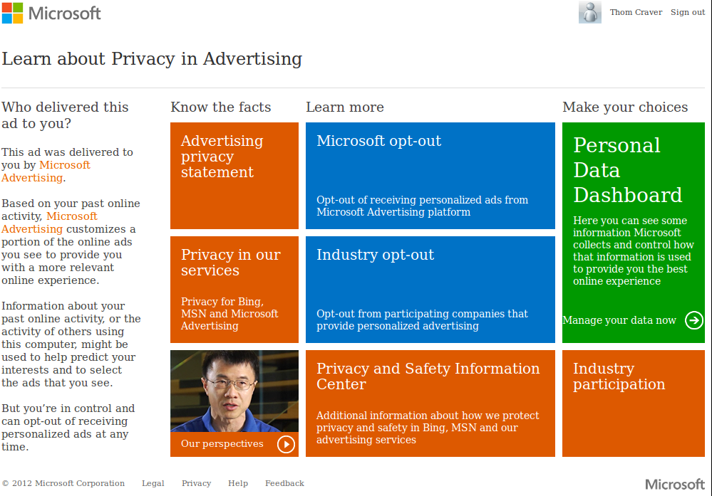
I was mucking around with Microsoft privacy settings in my Outlook.com account and came across this page. It essentially describes Microsoft’s privacy policy with respect to ads and other services.

From a user design standpoint, it makes certain sections stand out and corresponds with their three subheadings of knowing, learning and doing.What struck me was the multi-colored tiled layout. Between XBox, Windows Phone and Windows 8, I didn’t think Microsoft could go any further.
 Logos have changed, too. Look at the new Microsoft Corporate Logo and the new Office 2013 logos. Granted the latter aren’t completely tiles, but they’ve been designed to include a tiled theme seamlessly.
Will this tiled approach eventually catch on with the world if they keep putting it in our face? Windows phone sales still only have 3% of the market, but are up more than double from the year prior.
Do you like the tiles? Are they growing on you?
